
New Twitter Buttons
3 posters
Page 1 of 1

New Twitter Buttons
![]() by Dazzler Wed Jun 16, 2010 8:19 pm
by Dazzler Wed Jun 16, 2010 8:19 pm
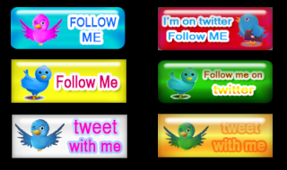
Check out my new twitter buttons! I created this using Photoshop CS4  . What do you think?!


Dazzler- Administrator

- My mood :

Posts : 831
Points : 1648
Reputation : 5
Join date : 2010-05-13 Location : Fantasia
 -

Re: New Twitter Buttons
![]() by mikaela Fri Jun 25, 2010 10:40 pm
by mikaela Fri Jun 25, 2010 10:40 pm
Like the new buttons. Can you add them individually so I can use the image? I also like the facebook button. Thanks in advance Admin!

mikaela- Newbie

- My mood :

Posts : 63
Points : 103
Reputation : 0
Join date : 2010-05-14
Age : 45
Re: New Twitter Buttons
![]() by Dazzler Fri Jun 25, 2010 10:49 pm
by Dazzler Fri Jun 25, 2010 10:49 pm
Sure! But I'm actually editing them right now to put a stroke on the letter t on the twitter buttons. I'll add the glossy buttons first and then the others later.


These are not really good ones. I can post some better buttons next time
These are not really good ones. I can post some better buttons next time
Dazzler- Administrator
- My mood :
Posts : 831
Points : 1648
Reputation : 5
Join date : 2010-05-13 Location : Fantasia -
Re: New Twitter Buttons
![]() by mikaela Fri Jun 25, 2010 10:51 pm
by mikaela Fri Jun 25, 2010 10:51 pm
Thanks a lot! I like them because it's simple and cute. I can't even do something like this myself. I know nothing about graphic designing at all
mikaela- Newbie
- My mood :
Posts : 63
Points : 103
Reputation : 0
Join date : 2010-05-14
Age : 45
Re: New Twitter Buttons
![]() by Dazzler Fri Jun 25, 2010 11:14 pm
by Dazzler Fri Jun 25, 2010 11:14 pm
I'm not good either. Been practicing during my free time so I understand more now. I am just amazed how you can do so much with photoshop and that got me into graphic designing.
Dazzler- Administrator
- My mood :
Posts : 831
Points : 1648
Reputation : 5
Join date : 2010-05-13 Location : Fantasia -

The Dream- Moderator

- My mood :

Posts : 127
Points : 234
Reputation : 0
Join date : 2010-08-04 Location : Australia
Re: New Twitter Buttons
![]() by Dazzler Thu Sep 16, 2010 10:53 am
by Dazzler Thu Sep 16, 2010 10:53 am
Haha thanks James! I really appreciate the kind words. I am new at using Photoshop for graphic design and I'm enjoying it a lot. I know I need more practice though so if you have any suggestions, please feel free to throw it out . I'll be glad to listen to your suggestions because you're a good graphic artist too
Dazzler- Administrator
- My mood :
Posts : 831
Points : 1648
Reputation : 5
Join date : 2010-05-13 Location : Fantasia -
Re: New Twitter Buttons
![]() by The Dream Fri Sep 17, 2010 2:42 pm
by The Dream Fri Sep 17, 2010 2:42 pm
Here goes 
I find you're using a bit too much gloss. Maybe less would be better, but a small amount of gloss is always good
The font colours against the backgrounds sometimes are difficult to read, but only when you're not concentrating too much. (These are all for the second set, not the 'T' buttons)
Good luck
The Dream- Moderator
- My mood :
Posts : 127
Points : 234
Reputation : 0
Join date : 2010-08-04 Location : Australia
Page 1 of 1
Permissions in this forum:
You cannot reply to topics in this forum|
|
|


» OHSAS Guidelines for Workplace Safety
» Review of Top Freelance Sites
» Builders have high time in Cochin
» Elite Mineral Makeup